Monday, September 28, 2009

Artist: Various Digital Painters


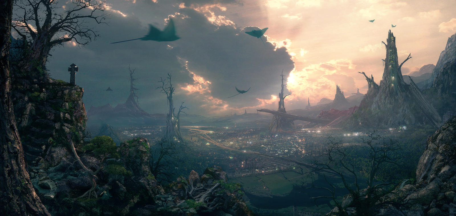
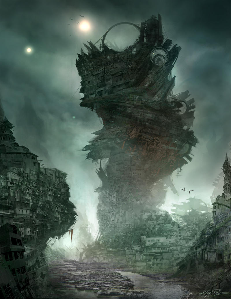
I started looking around the web for an artist to do this post on, and ended up getting lost browsing various digital landscape paintings on DeviantArt. I often find myself browsing this site for hours at a time; the potential for inspiration is endless. There's also something really nice about viewing digital art and photos on a computer screen. These pieces were created on-screen, and the range of colors, whites, and blacks look fantastic portrayed on something that emanates its own light.

That said, I think I've always had my head up in the clouds, and it's stuff like this that my imagination thrives on. The images are just bursting with creativity. Sharp details mixed with rugged style and texture, portraying surreal landscapes. After looking at them it's hard to write as I keep getting lost in the thought of where I can go with my own work. Can I achieve a similar amount of creativity with my photographs and collages? The more I think about it the more I feel like what I want to portray doesn't really exist, therefore cannot be found and photographed. I'd really like to learn more about this process and give it a try; maybe I'll look into it for my next post. It's possible that I could implement digital painting into my collage work, but who knows if this method would fit in with my work this semester. There's so many incredible pieces, these are just a few.


http://nachoyague.deviantart.com/
http://tarrzan.deviantart.com/
http://i-netgrafx.deviantart.com/

Friday, September 25, 2009

Topic: Threshold

I've been thinking more about what direction I'm going in with this light pollution idea, and looking at Tom Simmons' work last weekend revealed a little more to me. What my night photos reveal is the threshold between man and nature, seen more clearly than photos during the daylight hours could ever show. We use artificial lighting to control our environment, adding visibility, safety and comfort. In doing this, the fragile and ever-changing border between man and nature becomes crystal clear at night, especially through the lens and slow shutter of a still camera. I think this is inherently what has drawn me to night photography all along, I just never realized it until now.

For great night photos you really need artificial light. Since still cameras are capable of extremely long exposures you can draw light from the moon to reveal a completely dark forest. I've done this however, and the images often just come across as overcast daytime pictures. The colors are plain, and if there's no wind or moving water in the frame there really isn't anything that brings out the greatness of night photography. Now if there was a distant streetlight of if there were city lights leaking into the sky above, the picture would transform dramatically. The camera would draw from this light with exaggerated colors and exposures giving a surreal existence to everything. White balancing for the moon would make the light from that incandescent streetlight red-orange, and balancing for the streetlight would make that moonlight a supernatural blue. Additionally, you could balance for something like shade or fluorescent light and get a range of blues or oranges or anything in-between.

Setting colors aside, just the way artificial light reacts with nature is amazing. You get these rays coming from a low angle, but not in the way a setting sun hits the same side of every tree in the forest creating consistent shadow. This streetlight is microscopic in comparison, and creates this little circular perimeter of light and shadow in the forest, an interaction that plays out much differently. Last fall through spring I would take Powhite Parkway back to Richmond from work, often getting off late at night. My route almost always found me sitting at a traffic light on Cumberland and Harrison. A fence there holds back a line of bushes that reach through the porous barrier, and there was this streetlight with a tree that almost completely surrounded its light source. The leaves and branches were thus lit in a way entirely contrary to their existence, with highlights hitting the bottoms of the leaves and shadow engulfing the tops, which are normally meant to catch the light instead. The intricate branch structure was also revealed from the inside out, the small nooks and ledges where thick branches begin cascading into twigs; places behind deep foliage normally only seen by the squirrels and birds that make them home. The tree looked naked, unnatural, and surreal, but also beautiful. I want to explore this threshold where artificial light meets natural darkness, portraying intricate interactions up close as well as remote boundaries from afar. Hopefully in doing this I will bring up the drastic and very possible future of a world where, outside of parks and zoos, this is the only nature that exists.

I have a lot of shooting to do, but just about all my night photos could be tagged with this concept. For instance the picture shown here I made from some images I took last semester. I like them as an illustration of these ideas because the light from the train acts in a similar way to how Tim Simmons' lighting setups work. The few seconds of harsh spotlighting really reveals the hillside in a kind of intrusive way. The weltered grass and shrubs, the kind of plants that can adapt to life in the city, just get completely drenched in low-angle, artificial light. I felt kind of helpless and exposed myself each time a train passed, so whatever wildlife calls this otherworldly niche a home must be pretty resilient (this is the beginning of the long, thin stretch of trails, forests, and parks wedged between midtown Richmond and the North bank of the James). Using passing cars or trains might be a good way to get an accurate real-life example of the way artificial light can spill into a natural environment without going so far as creating my own light, as Simmons does, which in my case would be detrimental to the concept.
Monday, September 21, 2009

Artist: Tim Simmons

Once again I've come across an artist who's work embodies many of the visuals I enjoy and often seek to convey in my own work. I found Simmons while searching for artists who depict the landscape as "sublime," something that he achieves with some of the most amazing night photos I've ever seen. He uses artificial lighting to light various natural and man-made scenes, often in which the source of light is eerily invisible. The complex lighting setups reveal beauty in these landscapes but also give them this slightly "off" feeling, as they seem a little too perfectly lit in ways that would never occur naturally. Many of the images seem to utilize HDR techniques, but I haven't been able to find out whether he does this or just uses a very complex lighting setup to achieve the amazing detail in light and shadow.

My last piece of the burning landscape from the Blue Ridge Parkway took a step in this direction I think, as I dropped the ISO down and lengthened the exposure in an attempt to get more perfect night photos with less grain, drawing in more light than the eye would see to get those enhanced nighttime lights and colors. I used available light however, and I wouldn't mind using some composed flash setups to create my own "light pollution," showing how eerie and unnatural it is when man's rigid control meets nature's fluid balance. Simmons has so many amazing, inspiring photos that I'm just going to link a bunch of them here.


http://www.timsimmons.co.uk/index.php

Thursday, September 17, 2009

Topic: Light Pollution


I've done a little research on light pollution with some interesting results. Much of it is the result of poorly designed outdoor lighting fixtures. Anything that radiates light above the horizon line, as most streetlights do, is pretty much wasting that light. A lot of energy and light pollution can be saved by simple adjustments to light design. Some of the worst examples are that of architectural, spotlight, or billboard lighting fixtures which point from the ground up into the sky. The effects on the visibility of the night sky are huge:

The pictures above show the same constellation of stars with different amounts of light pollution in the sky. The differences are astounding, especially for me as I draw much inspiration from the night sky.

The excessive amounts of light have been found in cases to lead to stress, fatigue, headaches, decreased sexual function, elevated blood pressure, anxiety, sleep disruption, and even breast cancer. The reasons vary, and some pertain to certain types of light, but I believe the biggest argument is a simple case of offsetting the natural day-night cycle that has been lived by forever. The implications on natural ecosystems is even more obvious. Many nocturnal animals that had adapted to see at night become blinded by artificial lights, disrupting their living and hunting patterns. Insects that navigate using the stars or the moon become disoriented, including those that are necessary for pollinating certain flowers. Just as they do with clear glass panes, migrating birds often blindly fly into brightly lit buildings. Another sad case are that of sea turtle hatchlings. To find the sea, they travel away from the darkness of the sand dunes, thus are confused when artificial light is thrown into the picture, a heartbreaking addition to the already huge number of natural and artificial dangers they face.

Basically, it seems as if our use of light is much too lackadaisical, overlooking many negative implications. A transition to energy-efficient bulbs is a huge step, but the actual fixtures need reworking as well. At least as a photographer I can use my camera to "recycle" these stray light rays into my pictures, something I talk more about in this post I made last summer.

light pollution: http://en.wikipedia.org/wiki/Light_pollution

Sunday, September 13, 2009

Artist: John Gerrard

John Gerrard is an amazing artist I came across a few months ago who's work strongly advocates conservation in one of the most unique and awe-inspiring ways I've ever seen. His work is entirely digital, but uses the medium to its fullest potential in depicting photo-realistic, virtual environments that live, playing before you in real time. The description quoted from his website of the piece titled "Oil Stick Work" (first image) really puts this ambitious method in perspective.

"'Oil Stick Work (Angelo Martinez / Richfield, Kansas) 2008' is a virtual sculpture that depicts a solitary aluminum corn silo on the austere landscape of the American Great Plains. At daybreak, in real time, Angelo Martinez, a Mexican-American builder, arrives at the silo and carefully creates a black square on the exterior of the structure with an oil stick crayon. Within thirty years, working a six-day week from dawn to dusk, the building will be entirely coated, transformed into a dark object on the landscape. In 2038 the Martinez character will complete his task and leave the scene."

The piece relay's the concept of the passage of time astoundingly, and brings to light how deeply rooted oil has become in all aspects of our society, namely in food production. This problem is further emphasized in "Grow Finish Unit," (below) a similar piece that portrays a fully automated pig production plant in detail that is both striking and horrific. It reminds the viewer of the sinister process behind such factories, machines which essentially breed pigs from oil, pumping the waste into the surrounding environment.

Gerrard's use of time sends tingles down my spine, and I think every time I've read about his work I've honestly become one step closer to becoming vegetarian, and it's this type of influence that I want my work to have. Gerrard has an opening at the Hirshhorn on Nov 5th, can't wait!

http://www.johngerrard.net/index.php?Homepage

Thursday, September 10, 2009

Topic: Conservation

I've been thinking of ways to tie the topic of conservation more strongly into my work. I think the most important thing is going to be research. Simply portraying beautiful environments and examples of pollution is not often enough. I'm going to need to do a lot of research on both local and global problems and incorporate these into my work. Captions might be needed with each piece to get these across.

One of the benefits of collage work is that I can tie different images taken at different times together into one piece, giving it more effect. Back in my first digital photography class a couple years ago I had a professor that really stressed conceptual work, so I did a piece on conservation then, shown below.

detail left


detail right


Here I was able to photograph deer under the factory lights on an entirely different side of the factory from which I shot the rest of the piece, as well as a number of hours earlier in the night. With this process I was able to piece the deer in and increase their numbers. I'd like to do more of this this semester.

Even with that piece however, I was really just an observer. The factory affected me personally, as it was built a number of years ago next to my grandparent's farm in Suffolk, Virginia. Many of my weekends and holidays were spent there, and still are, and the chemical plant has been a loud, bright addition to the area ever since it was built. I really don't know how much or what sort of waste it creates though, and what effect it has had on the surrounding environment other than that of its physical presence. The piece I did was therefore essentially just an observation, and the deer shown in juxtaposition of the factory really just a symbol. Deer thrive in that area, probably more so than they did before people came and plowed farms full of food for them and drove out predators. So I really wasn't making a case for them in the piece, as they probably still get along just fine with the factory there. It was very strange and unnatural to be able to photograph deer without a flash at night under those factory lights though.

My point is that if I'm going to promote change I need to find and focus my work around things that need, for good reason, to be changed. Simply observing man's interaction with and encroachment on nature isn't going to be effective enough.

Monday, September 7, 2009

Artist: David Hockney

David Hockney is an English artist most known for his paintings, but who has also done Polaroid collages. In a cubist style, he shoots from slightly different angles and exposures, and allows information to duplicate in these pieces, due to either his own movement or that of the subject. This method sparked from simply trying to piece together a wide-angle type shot without getting the distortion of a wide-angle lens. Instead of lens distortion, the cubist-type visual of the collage attracted him to the process, and he even dropped painting altogether for a time in order to follow it. This is very similar to the way I got involved in the process, originally trying to simply stitch together a panoramic image, but enjoying the process and the way it showed in the final piece.

Hockney also works a lot with the edges of the various collage pieces, allowing them to form jagged lines and even stretch out away from the main cluster of images. These stylistic choices add a lot of visual and conceptual dimension to his work, something that I'm trying to do this semester. I also noticed one of the display methods used in a gallery, in which the piece was set a couple inches off the gallery wall. Since it wasn't mounted, the jagged edges formed by the individual Polaroids created a very nice shadow on the wall behind the piece. I've created and displayed a collage like this once before back in AFO, and I might look into re-visiting it this semester. It seems as if Hockney was one of the pioneers of this type of photographic work, so I'm very glad that it was recommended that I look into him.http://www.hockneypictures.com/

Thursday, September 3, 2009

Topic: Display Methods

I've been thinking more about how to add another dimension to my work, and after looking at different suggestions that people have made I think I might have come to the best conclusion of how to go about it. I don't think I want to explore physically building a collage 3-dimensionally. While It could work well, I really don't want to leave the accessibility of digital editing behind right now. I've become used to the method and at the same time feel there is a ton more possibility to be had with it.

With that said, I do think I could display these works in a better way once they're printed. Most of my work is printed large with the excess of collaged imagery often displaying more of an environment than the human eye could take in at once (i.e. 360 degree panoramic). As some have suggested, it might be more natural to display these prints on a curved surface rather than flat wall. This should be enough of a step into the 3rd dimension to add that necessary edge to my work without tinkering with the integrity of the process. For example, the sky spiral piece I've been working on could be displayed overhead on a surface (maybe wood?) that curves nearly a half circle. The picture to the left shows the type of shape I have in mind for the backing, but I would use different sizes and degrees of curve. I may even try to shoot for specific projects that can take advantage of this type of display. For instance, I may shoot another 360 degree panoramic that could be displayed in a large full circle that could be viewed from the inside, or maybe a piece where a floor display would match its perspective. I've got some time to think about this, but I need to make sure I start creating these backings relatively soon so I don't end up half-ass'ing them as I admit I've done in the past when it came to creating displays / hanging work.

Image source: http://eartheasy.com/store/prodimages/gdn_raised_curvedtim.jpg